Your knowledge base should be less like a teenagers cupboard, and more like a supermarket. Here's how.
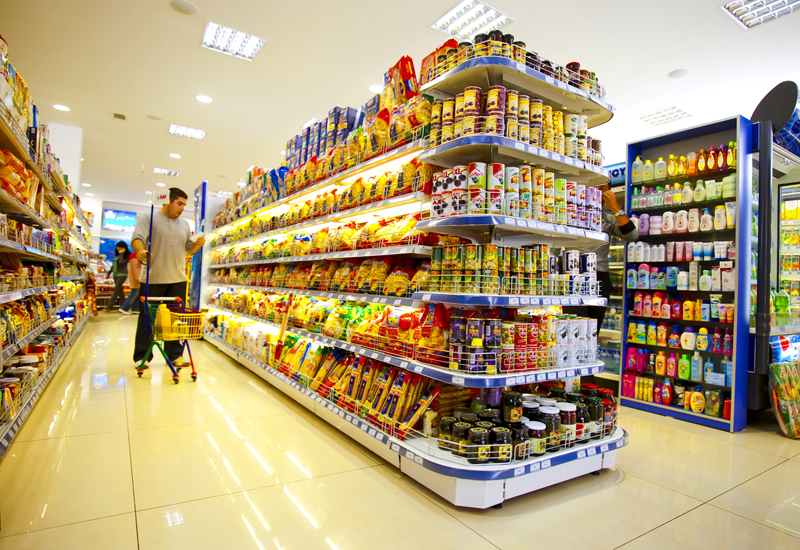 |
| Image from wikimedia commons |
Too many knowledge bases use the "teenager's bedroom" approach )which I mentioned in this blog post) - where you dump everything into the knowledge base willy-nilly and rely on a good search engine to dig it out again. However the problem with relying on search is two-fold:
- Good search requires good indexing and SEO, and
- You need to know what you are looking for before you can search.
Sometimes the user needs to browse instead, especially if they are not sure what knowledge they need (i.e. they don't know when they don't know).
Here the supermarket is a good model. Supermarkets rely on people finding the content they need, so they can buy it. They also give a lot of though to pointing the customers towards other products, which they might not have known they needed. Every aspect of a store’s layout, from the flower display near the entrance to the chocolate by the check-out is designed to stimulate "shopping serendipity".
- Flowers, fruit and vegetables at the entrance make the store smell and look good
- Quick-use "grab and go" items such as snacks and bottled water are at the entrance, for people who want to shop quickly
- Promotional items are at the aisle-ends, so are in plain sight
- Products are grouped by type (pasta, tins, cheese, butter) to make them easier to find
- Popular high-value items are displayed at eye-level
- Often there are themed displays - a Mexican section with sauces, tacos, tortillas, refried beans for example, or an Indian section with curry spices, sauces, poppadums and Naan bread - so you can buy all you need for a single meal
- Warm colours attract people to a store, hence the warm brick exteriors. Cool colours inside encourage more contemplation and higher sales
- Loyalty cards are used to track customer activity, and to learn more about customer behaviour.
Can we use similar principles to encourage users to browse our knowledge bases? We could try similar approaches to colours for example, putting the high value items in the high-visibility page space, promoting new knowledge where it is most visible, grouping and associating content so that all knowledge related to a particular process or activity is grouped together (see here), placing the "grab and go" items on the front page, and using web metrics to understand the behaviour of our knowledge customers, so we can improve the design of the knowledge base.
If we make our knowledge bases a little more like supermarkets and a little less like teenagers' bedrooms, we stand a better chance of attracting and keeping the browsing customers, and helping them to find knowledge that they didn't even know they needed.


No comments:
Post a Comment